Product design
UX research
Team leadership
From onboarding to first book: increasing conversion by 90%
I led an end-to-end redesign of Blurb’s onboarding experience to reduce friction and clarify user choice when starting a new book. This redesign of the onboarding experience increased user conversion by 90%.
Year
2017
Role
Director of UX
Company
Blurb
Scope
Onboarding redesign, UX strategy, Website optimization
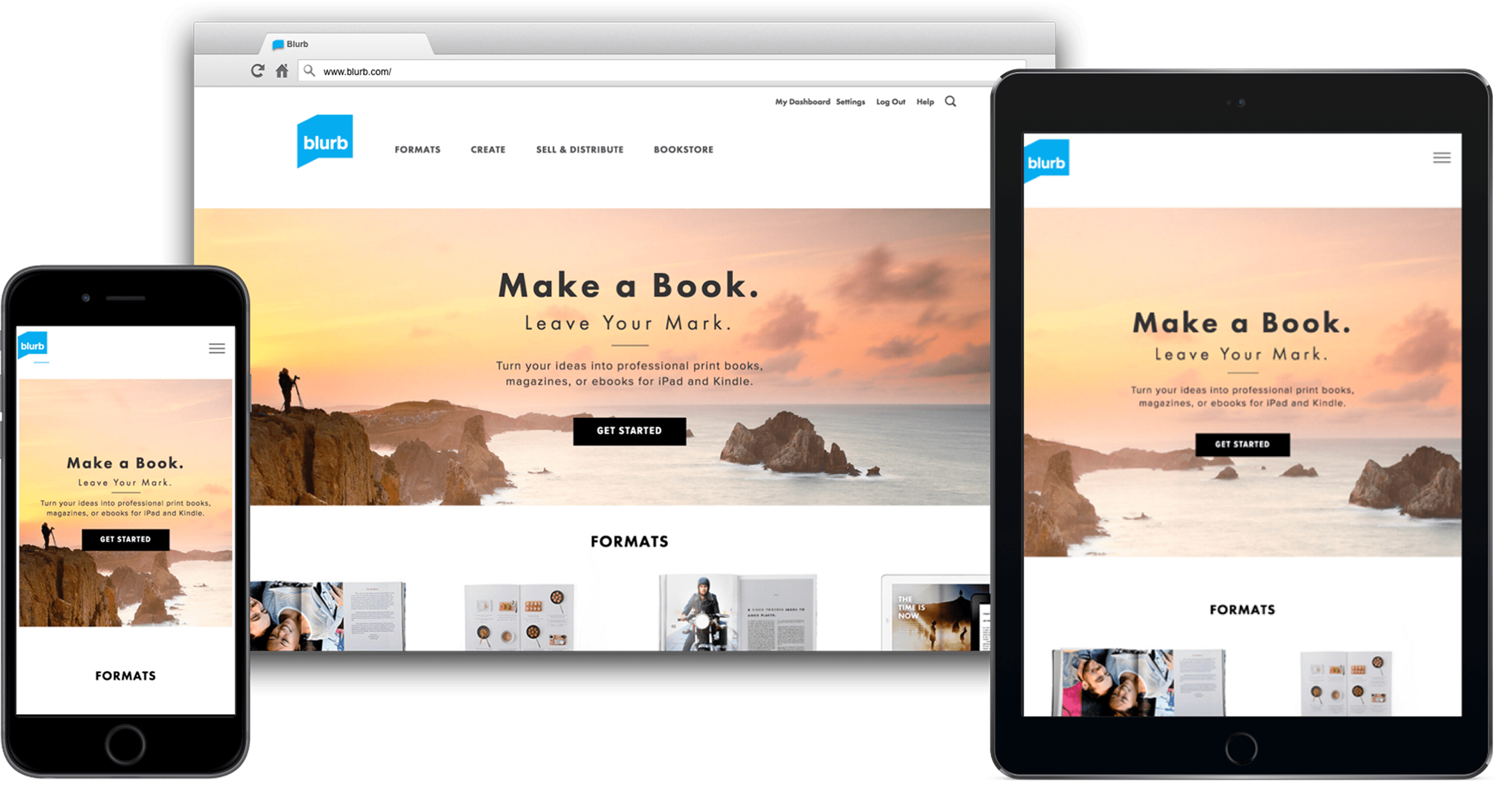
The redesigned home page made Get Started front and center, so people knew how to start making their book right away.
The problem
A recent site redesign had introduced critical friction points that tanked performance:
Onboarding Friction: Users were forced to choose a technical tool before deciding on a book type, leading to "paralysis of choice."
Dark Patterns: Confusing product info and unexpected software downloads frustrated new visitors.
Tool Fragmentation: Five different creation tools existed with inconsistent capabilities, creating a steep learning curve.
Declining Metrics: Post-launch performance was poor that the CPO approached me and asked me to run a redesign of the website and onboarding experience.
I was excited to take this on. I ran the project with a small team — a product manager and three designers / researchers.
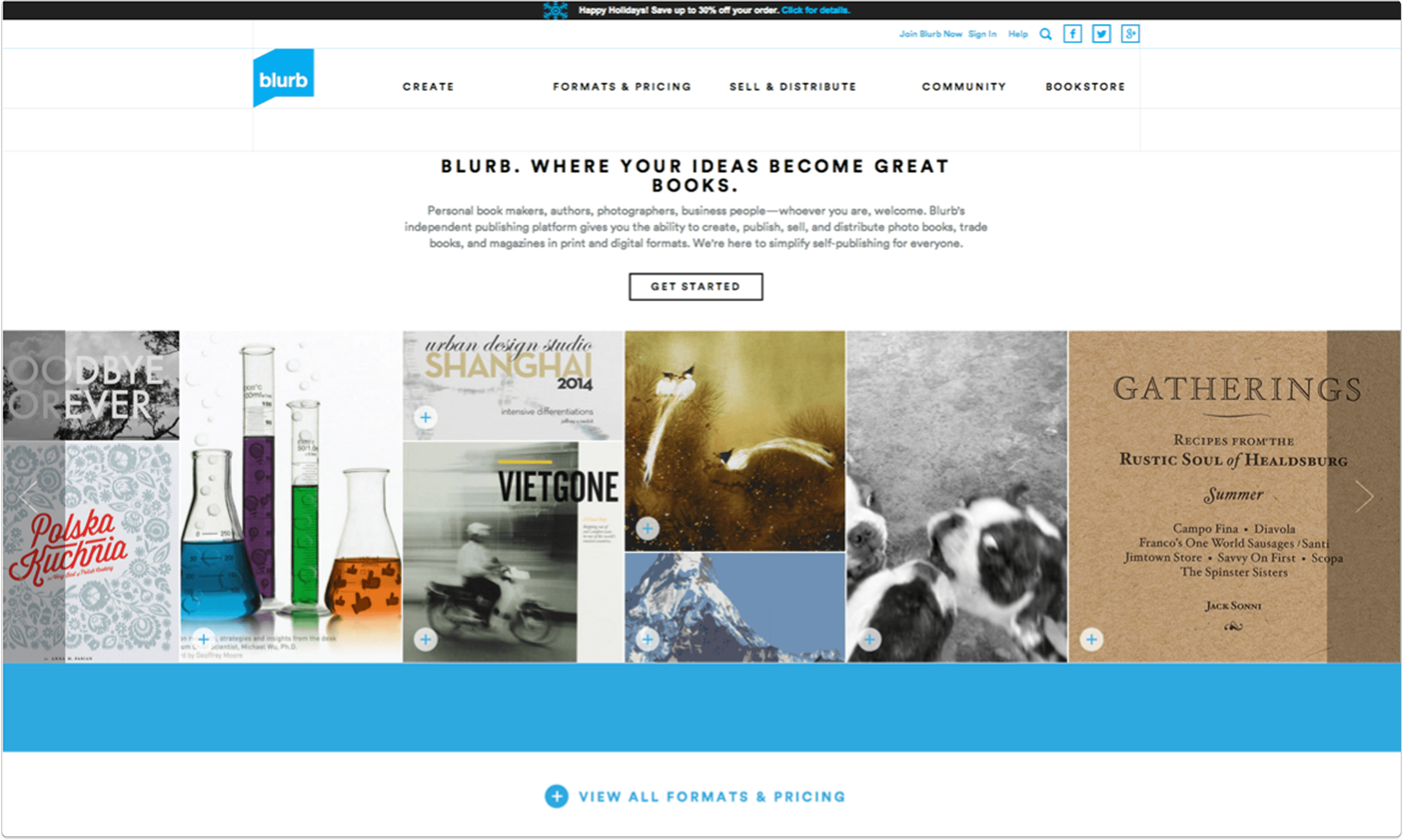
This prior home page was confusing because no one knew where to start. One of the biggest complaints in user testing was that all image boxes on the page were clickable but led nowhere.
The solution
To solve for "paralysis of choice," I led a full-scale redesign of the onboarding and core site architecture:
Simplified Navigation: Eliminated overwhelming legacy content and unified the Help Center.
Logic Shift: Pivoted the start flow from technical tool selection to user-intent (book type).
Interactive Utility: Consolidated fragmented pricing pages into a single, mobile-friendly calculator.
This page was so successful that it is still being used on the Blurb site today, years later.

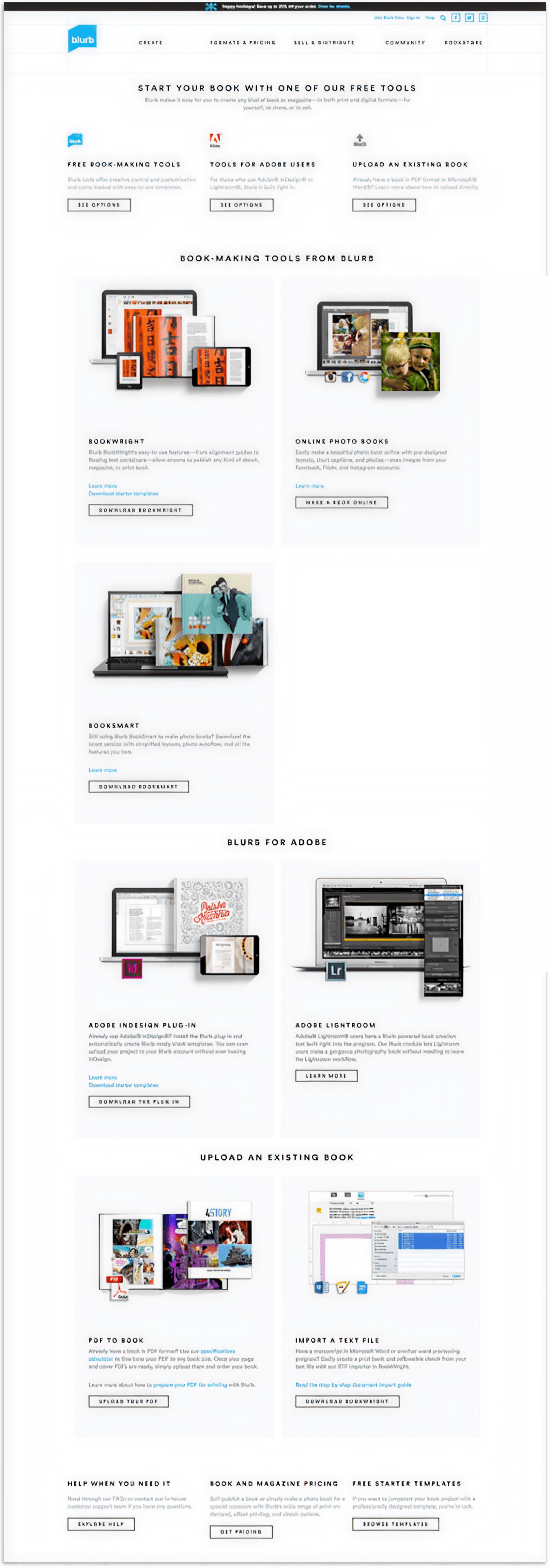
Before the redesign of this page, a book creator had to cross reference several pages to understand what book to make: the pricing page, the bookmaking tools page and the book types page. There was not one clear path to get started.
My role
As Director of UX, I provided a design vision and strategy for the website, drove the UX team's research and design efforts and contributed to many key design decisions.
I worked closely with product, engineering and program management to prioritize and plan the roadmap.
I made sure that we included testing and research in our sprint cycles, and ran them.
I ensured access to resources the team needed like research tools, design team feedback meetings and guidance.
I matched the team with challenges addressed to their skills and career goals.
Part 1: Website redesign
testing to establish a baseline
We knew the redesign was problematic, but we didn't know exactly how, until we ran usability tests.
In a matter of days we benchmarked specific tasks on UserTesting.com with 20+ people across mobile, website and tablet.
We learned that:
People felt overwhelmed and didn't know where to start
There was a lot of reading copy for understanding; these customers wanted to drop off
Site looked more modern
Poor usability around core functions, including pricing calculator, product info and navigation
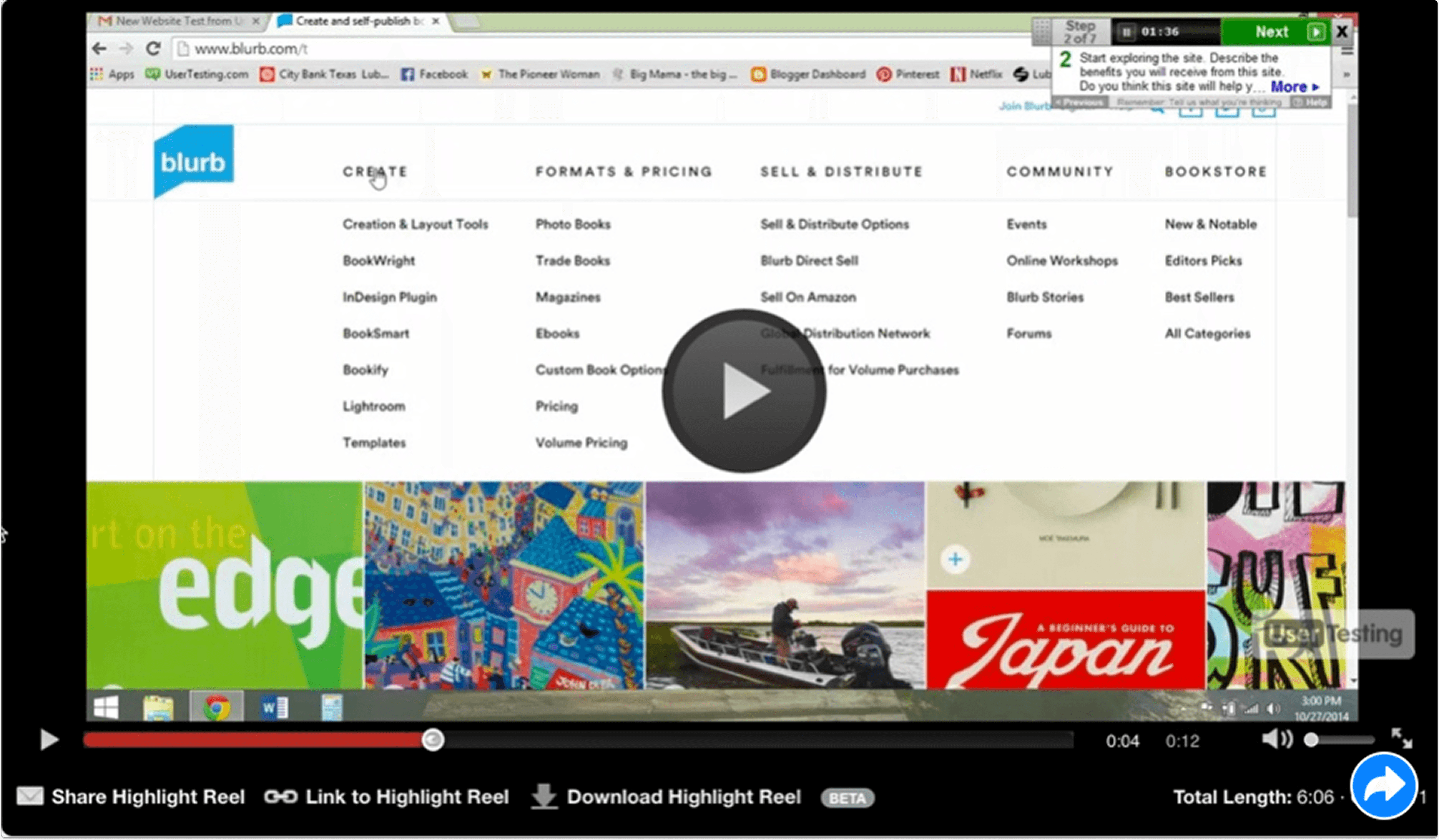
A big problem for people was the mega fly out nav menu, where all the options popped up all at once on hover. It was extremely overwhelming.
Planning & project goals
I ran a workshop to identify the main problems we needed to solve as part of this web redesign, then roughed out a website site map, addressing the problems we wanted to solve for along with our business goals.
Business goal: Get more people to purchase more books (print and ebooks)
Get people to make more books (and buy)
Get people to purchase published books
Business metric: Increase overall % project starts per session (not downloads alone)
UX goal: Create an experience that is…
Functional: Users can complete tasks at hand with ease
Consistent: Look and feel, and navigation should match across the site
Engaging: Address user questions and move through conversion funnel

The workshop I ran helped us rough out the website map and hone in on our main goals.

We created an issues tracker to identify and track tasks to help us reach our goals.
Part 2: pricing calculator
The pricing page(S)
In our baseline testing we learned that people were confused about our pricing pages - because we had two of them.
Each of these pages allowed you to calculate the cost of your book based on cover, paper type and page count.
However, having two pages split SEO traffic and hurt our rankings.

Two pricing pages with different designs only added to the confusion and diluted our rankings.

In user testing we learned that entering a quantity calculated a total price for the volume, but people wanted to see a unit price. Volume prices fell below the fold, so people couldn't see them in the calculator view.

The new calculator took the best of both pages, giving people a way to look at not just unit cost but total cost if ordering in volume.
The result
We consolidated the pages, improved the interactions so that people could see the numbers refresh (so they knew it was calculating) and designed a mobile-friendly version.
The end result was an increase in pageviews by 215%.

Increase in pricing calculator pageviews
Increase in pricing calculator pageviews
100%
100%
100%
100%
part 3: get started page
This page was the main entry into the get started flow. People had to select from the tool they wanted to use but they experienced “paralysis of choice.”
They really wanted to decide on the type of book, not have to decipher a page full of tools.
This page was the main entry into the get started flow. People had to select from the tool they wanted to use but they experienced “paralysis of choice.”
They really wanted to decide on the type of book, not have to decipher a page full of tools.
This page was the main entry into the get started flow. People had to select from the tool they wanted to use but they experienced “paralysis of choice.”
They really wanted to decide on the type of book, not have to decipher a page full of tools.
created prototypes, tested in person
At the time, we did rapid paper prototyping in a cafe to test basic user flows. We learned that people would come to the site with a specific book type in mind, usually with a size too.

As we evolved the prototype, we learned that people want to start making their book, playing around with choices and seeing something happen, rather than having to first think about the tool to use. We had to reduce the number of steps.

evolving the design
It turned out that some of the elements in the flow were very similar to another module we had created for our formats pages. So we took our learnings and evolved the design. And we added a pencil, for context.

The result
This new design had a 90% improvement in conversion rate (people clicking through to download or start in a tool).

Increased conversion to new book creation
Increased conversion to new book creation
0%
0%
0%
0%
Product design
UX research
Team leadership
From onboarding to first book: increasing conversion by 90%
I led an end-to-end redesign of Blurb’s onboarding experience to reduce friction and clarify user choice when starting a new book. This redesign of the onboarding experience increased user conversion by 90%.
Year
2017
Role
Director of UX
Company
Blurb
Scope
Onboarding redesign, UX strategy, Website optimization
The redesigned home page made Get Started front and center, so people knew how to start making their book right away.
The problem
A recent site redesign had introduced critical friction points that tanked performance:
Onboarding Friction: Users were forced to choose a technical tool before deciding on a book type, leading to "paralysis of choice."
Dark Patterns: Confusing product info and unexpected software downloads frustrated new visitors.
Tool Fragmentation: Five different creation tools existed with inconsistent capabilities, creating a steep learning curve.
Declining Metrics: Post-launch performance was poor that the CPO approached me and asked me to run a redesign of the website and onboarding experience.
I was excited to take this on. I ran the project with a small team — a product manager and three designers / researchers.
This prior home page was confusing because no one knew where to start. One of the biggest complaints in user testing was that all image boxes on the page were clickable but led nowhere.
The solution
To solve for "paralysis of choice," I led a full-scale redesign of the onboarding and core site architecture:
Simplified Navigation: Eliminated overwhelming legacy content and unified the Help Center.
Logic Shift: Pivoted the start flow from technical tool selection to user-intent (book type).
Interactive Utility: Consolidated fragmented pricing pages into a single, mobile-friendly calculator.
This page was so successful that it is still being used on the Blurb site today, years later.
Before the redesign of this page, a book creator had to cross reference several pages to understand what book to make: the pricing page, the bookmaking tools page and the book types page. There was not one clear path to get started.
My role
As Director of UX, I provided a design vision and strategy for the website, drove the UX team's research and design efforts and contributed to many key design decisions.
I worked closely with product, engineering and program management to prioritize and plan the roadmap.
I made sure that we included testing and research in our sprint cycles, and ran them.
I ensured access to resources the team needed like research tools, design team feedback meetings and guidance.
I matched the team with challenges addressed to their skills and career goals.
Part 1: Website redesign
testing to establish a baseline
We knew the redesign was problematic, but we didn't know exactly how, until we ran usability tests.
In a matter of days we benchmarked specific tasks on UserTesting.com with 20+ people across mobile, website and tablet.
We learned that:
People felt overwhelmed and didn't know where to start
There was a lot of reading copy for understanding; these customers wanted to drop off
Site looked more modern
Poor usability around core functions, including pricing calculator, product info and navigation
A big problem for people was the mega fly out nav menu, where all the options popped up all at once on hover. It was extremely overwhelming.
Planning & project goals
I ran a workshop to identify the main problems we needed to solve as part of this web redesign, then roughed out a website site map, addressing the problems we wanted to solve for along with our business goals.
Business goal: Get more people to purchase more books (print and ebooks)
Get people to make more books (and buy)
Get people to purchase published books
Business metric: Increase overall % project starts per session (not downloads alone)
UX goal: Create an experience that is…
Functional: Users can complete tasks at hand with ease
Consistent: Look and feel, and navigation should match across the site
Engaging: Address user questions and move through conversion funnel
The workshop I ran helped us rough out the website map and hone in on our main goals.
We created an issues tracker to identify and track tasks to help us reach our goals.
Part 2: pricing calculator
The pricing page(S)
In our baseline testing we learned that people were confused about our pricing pages - because we had two of them.
Each of these pages allowed you to calculate the cost of your book based on cover, paper type and page count.
However, having two pages split SEO traffic and hurt our rankings.
Two pricing pages with different designs only added to the confusion and diluted our rankings.
In user testing we learned that entering a quantity calculated a total price for the volume, but people wanted to see a unit price. Volume prices fell below the fold, so people couldn't see them in the calculator view.
The new calculator took the best of both pages, giving people a way to look at not just unit cost but total cost if ordering in volume.
The result
We consolidated the pages, improved the interactions so that people could see the numbers refresh (so they knew it was calculating) and designed a mobile-friendly version.
The end result was an increase in pageviews by 215%.
Increase in pricing calculator pageviews
Increase in pricing calculator pageviews
100%
100%
100%
100%
part 3: get started page
This page was the main entry into the get started flow. People had to select from the tool they wanted to use but they experienced “paralysis of choice.”
They really wanted to decide on the type of book, not have to decipher a page full of tools.
This page was the main entry into the get started flow. People had to select from the tool they wanted to use but they experienced “paralysis of choice.”
They really wanted to decide on the type of book, not have to decipher a page full of tools.
This page was the main entry into the get started flow. People had to select from the tool they wanted to use but they experienced “paralysis of choice.”
They really wanted to decide on the type of book, not have to decipher a page full of tools.
created prototypes, tested in person
At the time, we did rapid paper prototyping in a cafe to test basic user flows. We learned that people would come to the site with a specific book type in mind, usually with a size too.
As we evolved the prototype, we learned that people want to start making their book, playing around with choices and seeing something happen, rather than having to first think about the tool to use. We had to reduce the number of steps.
evolving the design
It turned out that some of the elements in the flow were very similar to another module we had created for our formats pages. So we took our learnings and evolved the design. And we added a pencil, for context.
The result
This new design had a 90% improvement in conversion rate (people clicking through to download or start in a tool).
Increased conversion to new book creation
Increased conversion to new book creation
0%
0%
0%
0%
Product design
UX research
Team leadership
From onboarding to first book: increasing conversion by 90%
I led an end-to-end redesign of Blurb’s onboarding experience to reduce friction and clarify user choice when starting a new book. This redesign of the onboarding experience increased user conversion by 90%.
Year
2017
Role
Director of UX
Company
Blurb
Scope
Onboarding redesign, UX strategy, Website optimization
The redesigned home page made Get Started front and center, so people knew how to start making their book right away.
The problem
A recent site redesign had introduced critical friction points that tanked performance:
Onboarding Friction: Users were forced to choose a technical tool before deciding on a book type, leading to "paralysis of choice."
Dark Patterns: Confusing product info and unexpected software downloads frustrated new visitors.
Tool Fragmentation: Five different creation tools existed with inconsistent capabilities, creating a steep learning curve.
Declining Metrics: Post-launch performance was poor that the CPO approached me and asked me to run a redesign of the website and onboarding experience.
I was excited to take this on. I ran the project with a small team — a product manager and three designers / researchers.
This prior home page was confusing because no one knew where to start. One of the biggest complaints in user testing was that all image boxes on the page were clickable but led nowhere.
The solution
To solve for "paralysis of choice," I led a full-scale redesign of the onboarding and core site architecture:
Simplified Navigation: Eliminated overwhelming legacy content and unified the Help Center.
Logic Shift: Pivoted the start flow from technical tool selection to user-intent (book type).
Interactive Utility: Consolidated fragmented pricing pages into a single, mobile-friendly calculator.
This page was so successful that it is still being used on the Blurb site today, years later.
Before the redesign of this page, a book creator had to cross reference several pages to understand what book to make: the pricing page, the bookmaking tools page and the book types page. There was not one clear path to get started.
My role
As Director of UX, I provided a design vision and strategy for the website, drove the UX team's research and design efforts and contributed to many key design decisions.
I worked closely with product, engineering and program management to prioritize and plan the roadmap.
I made sure that we included testing and research in our sprint cycles, and ran them.
I ensured access to resources the team needed like research tools, design team feedback meetings and guidance.
I matched the team with challenges addressed to their skills and career goals.
Part 1: Website redesign
testing to establish a baseline
We knew the redesign was problematic, but we didn't know exactly how, until we ran usability tests.
In a matter of days we benchmarked specific tasks on UserTesting.com with 20+ people across mobile, website and tablet.
We learned that:
People felt overwhelmed and didn't know where to start
There was a lot of reading copy for understanding; these customers wanted to drop off
Site looked more modern
Poor usability around core functions, including pricing calculator, product info and navigation
A big problem for people was the mega fly out nav menu, where all the options popped up all at once on hover. It was extremely overwhelming.
Planning & project goals
I ran a workshop to identify the main problems we needed to solve as part of this web redesign, then roughed out a website site map, addressing the problems we wanted to solve for along with our business goals.
Business goal: Get more people to purchase more books (print and ebooks)
Get people to make more books (and buy)
Get people to purchase published books
Business metric: Increase overall % project starts per session (not downloads alone)
UX goal: Create an experience that is…
Functional: Users can complete tasks at hand with ease
Consistent: Look and feel, and navigation should match across the site
Engaging: Address user questions and move through conversion funnel
The workshop I ran helped us rough out the website map and hone in on our main goals.
We created an issues tracker to identify and track tasks to help us reach our goals.
Part 2: pricing calculator
The pricing page(S)
In our baseline testing we learned that people were confused about our pricing pages - because we had two of them.
Each of these pages allowed you to calculate the cost of your book based on cover, paper type and page count.
However, having two pages split SEO traffic and hurt our rankings.
Two pricing pages with different designs only added to the confusion and diluted our rankings.
In user testing we learned that entering a quantity calculated a total price for the volume, but people wanted to see a unit price. Volume prices fell below the fold, so people couldn't see them in the calculator view.
The new calculator took the best of both pages, giving people a way to look at not just unit cost but total cost if ordering in volume.
The result
We consolidated the pages, improved the interactions so that people could see the numbers refresh (so they knew it was calculating) and designed a mobile-friendly version.
The end result was an increase in pageviews by 215%.
Increase in pricing calculator pageviews
Increase in pricing calculator pageviews
100%
100%
100%
100%
part 3: get started page
This page was the main entry into the get started flow. People had to select from the tool they wanted to use but they experienced “paralysis of choice.”
They really wanted to decide on the type of book, not have to decipher a page full of tools.
This page was the main entry into the get started flow. People had to select from the tool they wanted to use but they experienced “paralysis of choice.”
They really wanted to decide on the type of book, not have to decipher a page full of tools.
This page was the main entry into the get started flow. People had to select from the tool they wanted to use but they experienced “paralysis of choice.”
They really wanted to decide on the type of book, not have to decipher a page full of tools.
created prototypes, tested in person
At the time, we did rapid paper prototyping in a cafe to test basic user flows. We learned that people would come to the site with a specific book type in mind, usually with a size too.
As we evolved the prototype, we learned that people want to start making their book, playing around with choices and seeing something happen, rather than having to first think about the tool to use. We had to reduce the number of steps.
evolving the design
It turned out that some of the elements in the flow were very similar to another module we had created for our formats pages. So we took our learnings and evolved the design. And we added a pencil, for context.
The result
This new design had a 90% improvement in conversion rate (people clicking through to download or start in a tool).
Increased conversion to new book creation
Increased conversion to new book creation